
Professional charts from your spreadsheet data
Load your Excel file, pick a chart type, and export a high-resolution PNG in under two minutes. No code, no SQL, no cloud.
70+
Users registered
0
Joined this month
30+
Total downloads

Why not just use Excel?
Excel charts are holding you back
Three problems every analyst hits, and why switching takes two minutes.
Formatting eats your afternoon
Moving chart elements, wrestling with legend placement, fixing axis labels, Excel turns a 5-minute job into an hour. Graph Plotter keeps every setting in one dialog and remembers your style.
Blurry exports in client decks
Excel screenshots pixelate in PowerPoint and look unprofessional in print. Every Graph Plotter export is 220 DPI, sharp on screen, sharp in print, every time.
No Efficient Frontier in Excel
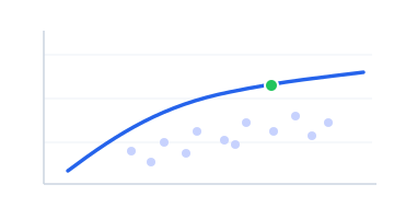
Portfolio optimization in Excel means writing VBA or Python macros. Graph Plotter generates the full Efficient Frontier, max Sharpe, min variance, frontier line, from your data in seconds.

Who it's for
Built for people who live in spreadsheets
From the trading desk to the lecture hall. If your data starts in Excel, Graph Plotter finishes it.

Finance
Financial Analysts
Portfolio charts and the Efficient Frontier, ready for the client deck.

Research
Investment Research
Turn raw research data into clean, shareable visuals in minutes.

Operations
Operations & Reporting
Recurring reports without the monthly formatting grind.

Academia
Academics & Students
Publication-ready charts at 220 DPI, no code, no LaTeX.
See what you can build
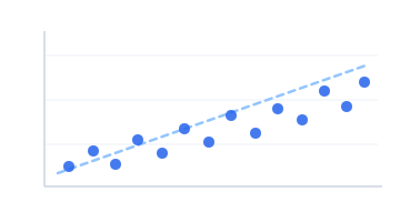
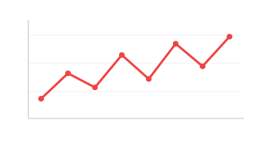
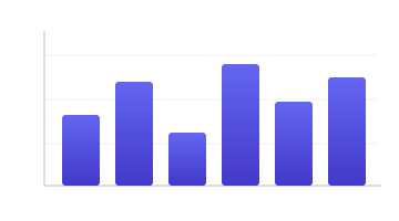
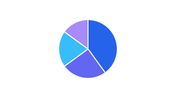
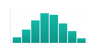
Real chart types, straight from spreadsheet data. Swipe through a few.

From the blog
Tips, tutorials and product updates. Read the latest below.
 Official
How to Generate Portfolio Risk Visuals
Learn how to generate portfolio risk visuals from Excel data faster, with clearer charts, better comparisons, and presentation-ready output.
 Official
7 Best Charts for Investment Presentations
Learn the best charts for investment presentations, when to use each one, and how to present performance, risk, allocation and timing clearly.
 Official
9 best charts for analysts that work
Find the best charts for analysts, when to use each one, and how to avoid misleading visuals in reports, decks, and data-heavy workflows.
 Official
7 Charting Tools for Analysts That Save Time
Compare charting tools for analysts by speed, output quality, flexibility and workflow fit, from Excel to specialist options for sharper charts.
 Official
How to Improve Chart Resolution Fast
Learn how to improve chart resolution for slides, reports, and print with better export settings, sizing, formats, and cleaner Excel workflows.
 Official
How to Turn Tables into Visuals Fast
Learn how to turn tables into visuals quickly, choose the right chart, clean Excel data, and export sharp, presentation-ready graphics.
 Official
How to Automate Weekly Reporting Visuals
Learn how to automate weekly reporting visuals with a repeatable Excel-first workflow that cuts formatting time and improves chart quality.
 Official
Why Are Excel Charts Blurry?
Why are Excel charts blurry? Learn the real causes, how export settings affect sharpness, and what to change for cleaner charts fast.
 Official
How to Create Investor Deck Charts
Learn how to create investor deck charts that look sharp, tell a clear growth story, and save hours of Excel formatting before every pitch.
Trusted by professionals in
Graph Plotter Pro
€39/mo
vs. the competition
Professional charts, 220 DPI exports, and the Efficient Frontier, at half the price of Tableau.
See all plansSeven chart types. One tool.
From daily KPIs to portfolio optimization, no switching between apps.
Built different, by design
Three things that make Graph Plotter the right tool for serious analysts.
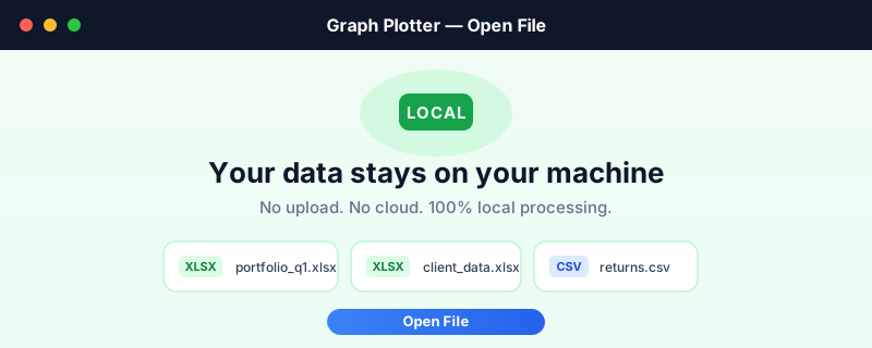
Privacy by Design
Your data never leaves your machine
Graph Plotter is a desktop app. Your Excel files and client data are processed entirely locally. Nothing is uploaded. Nothing is shared.
- ✓ No cloud upload, no third-party servers
- ✓ Works fully offline, no internet required
- ✓ Compatible with internal data policies
Export-Ready
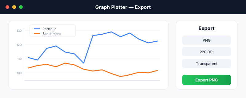
Drop it straight into your report
Every chart exports as a 220 DPI PNG. Sharp in print and on screen. Paste directly into PowerPoint, Word, or a client memo.
Your Style
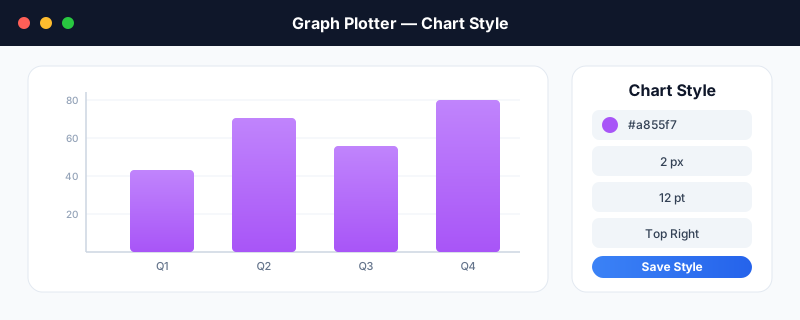
Every chart, exactly how you want it
Change colours, line thickness, font size, axis ranges, and legend position in one dialog. Styles save with your project. Reload and re-export with the same look every time.
- ✓ Per-series colours & line thickness
- ✓ Font size, axis limits & legend position
- ✓ Saved in your .gpplot.json project file
From the community

How it works
From raw data to finished chart in under two minutes.
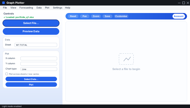
Open your Excel file
Load any .xlsx, .xlsm, or .xls workbook. All sheets and column headers are detected automatically.
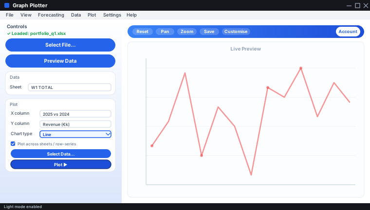
Pick a chart type
Choose from seven chart types. Select your columns, set your labels, and watch the preview update live.
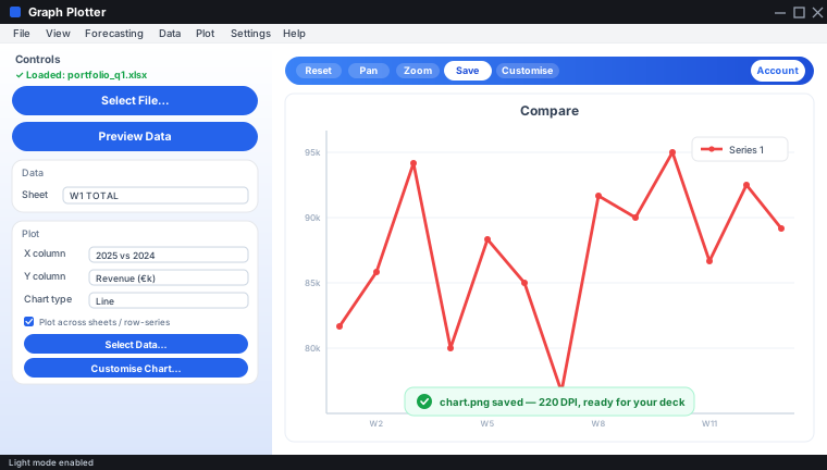
Export your PNG
Download a high-resolution PNG ready to paste into PowerPoint, Word, or a client deck.

A note from the founder
“During my first job, I noticed something; most people in the office would spend countless hours in Excel building graphs using their data. Only issue was, that it was completely inefficient and frustrating. Especially when the Excel sheets had a ton of data in them. So I built a tool with them in mind. Open your Excel file, pick a chart, export something sharp in two minutes. Customize it however you want with ease. No code, no cloud, no nonsense. I promise it will save you at least 1 to 2 hours a week.”
Start charting today
Free plan available. No credit card required. Your first chart in under two minutes.